|
3. Practical Color Wheel theory – how to use Color Wheel and color schemes PRIMARY, SECONDARY AND TERTIARY COLORS 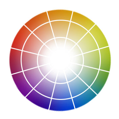 RYB Color Wheel I'll use here a RYB color wheel for a more traditional look on colors. The color wheel is a great help to understand the color theory in general and the theory of colors in design and painting. 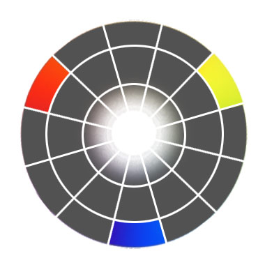 Primary colors on Color Wheel Let's start from the primary colors, placing them in the main triangle on the color wheel – these are yellow, red and blue. This is a very attractive color scheme, when used in design or painting. Colors are vibrant in this palette and work together very well, if you choose to make your painting or design using this color scheme. 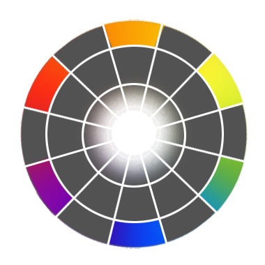 Secondary colors on Color Wheel The secondary colors will be created by mixing the primary colors. These are orange (red + yellow), green (mix yellow + blue) and violet (mix blue + red). 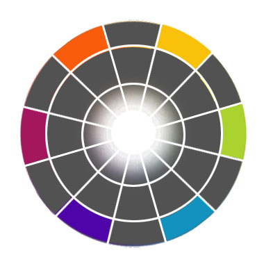 Tertiary colors on Color Wheel The next step will be creating tertiary colors by mixing secondary colors with primary color. (For example yellow+orange etc.) MONOCHROMATIC PALETTE The two definitive concepts in painting are Monochromatic palette and Warm/Cool color palettes. When we take a software color wheel and pick any color on the circle, the triangle in the center will give us all sorts of colors that are called Monochromatic colors. Monochromatic colors are tints, shades and tones with a single hue. In painting there is a very interesting technique, called Monchromatic Drawing, and there's even a Monchromatic Drawing Award, given by The Association of Science fiction & Fantasy Illustrators for masterpieces made with usage of a few number of colors in the painting. Usually with this type of technique it's very simple to give a single, definetive mood to a painting and it's a good play and good training itself in digital painting. WARM/COOL COLORS 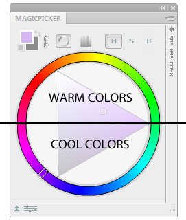 Warm and cool colors on color wheel Along with other cool features, John Derry made it very obvious to switch between cool and warm colors on the colour wheel. On the software color wheel (In MagicPicker Photoshop plugin implementation as well) the warm colors are on the top of the circle and the cool colors are on the bottom. You don't need to think everytime, when switching the color temperature. ANALOGOUS COLORS 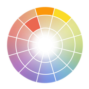 Analogous colors on color wheel Analogous colors, are the colors, placed close to each other on the color wheel. Usually a main color is picked as a dominating color and several others are used to accent the main color in this palette. OTHER COLOR SCHEMES Split-analogous color scheme 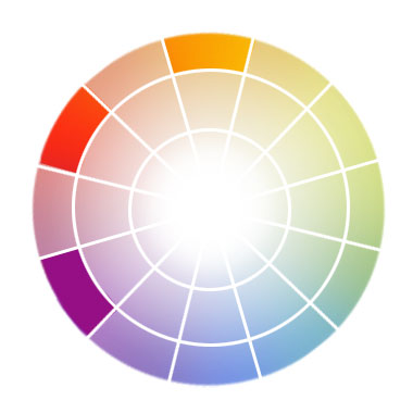 Split-analogous color scheme on color wheel It's the variation of analogous color scheme, when two other colors are placed on a larger distance from the main color. Complementary color scheme 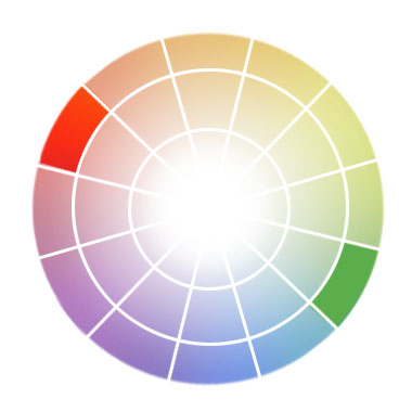 Complementary colors on color wheel With two opposite colors on color wheel you create a complementary color scheme. This will create the strongest contrast and vibrance between colors in color scheme. It's the most powerful scheme, but it's very hard to balance these colors. And one of the tricks, when balancing complementary colors is to desaturate a little the other color. Split-complementary color scheme 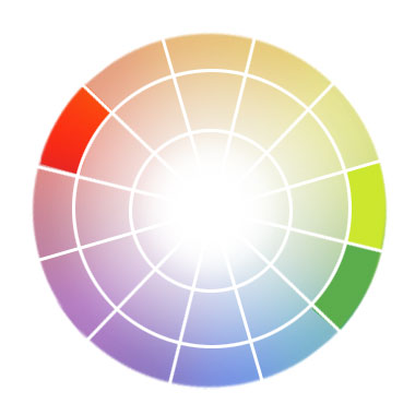 Split-complementary colors on color wheel To achieve better results when balancing colors in a compliment color scheme it's more convient to use a split-complementary color scheme. In this colour scheme the supporting colors are chosen for the opposite color to balance it. Triadic color scheme 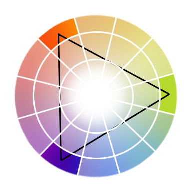 Triadic colors on color wheel In this color scheme you draw an imaginary triangle that defines colors that are equaly spaced on the color wheel. Primary colors create a triadic color scheme. It's the most commonly used color scheme in design, because colors create a good contrast while nicely playing together. Neutral color scheme 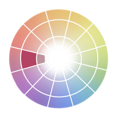 Neutral colors on color wheel Neutral color scheme is a variation of monochromatic color scheme, when only colors mixed with black or white are used – so called neutral colors. Accented neutral color scheme 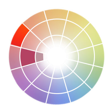 Accented neutral color scheme on color wheel It's a variation of neutral scheme, when a clear color is added to the colors. To make an accent. This is the most useful scheme, when you want to accent an object, or make it clearly standing against neutral background. NEXT: Installing and running MagicPicker panel TABLE OF CONTENTS: MagicPicker color wheel and color picker introduction : A brief history of Color Wheel : Practical Color Wheel Theory : Installing and running MagicPicker panel : Features of MagicPicker panel : How to use MagicPicker color wheel and color picker in Photoshop : Troubleshooting and frequently asked questions about MagicPicker / MagicPicker Photoshop Color Wheel SOURCES: http://en.wikipedia.org/wiki/Color_wheel *all images used in this article are used from public domain, taken from free sources or made by the author of the article. |
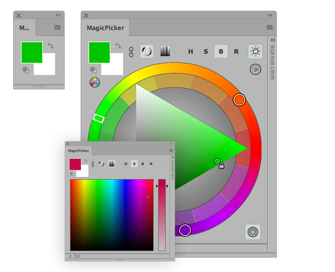 MagicPicker Illustrator & Photoshop color wheel manual (Illustrator & Photoshop CC, CS6, CS5, CS4, CS3).
 Download MagicPicker Illustrator & Photoshop Color Wheel/Color Picker Download MagicPicker Illustrator & Photoshop Color Wheel/Color PickerCheck other panels for Photoshop made by Anastasiy |